Advertising & Branding /
The Reception Logo That Looks Cheap in Every Photo
A finish that looks impressive in a sample case can disappear against the reception wall. Test the complete scene before ordering.
By Auronix Advertising
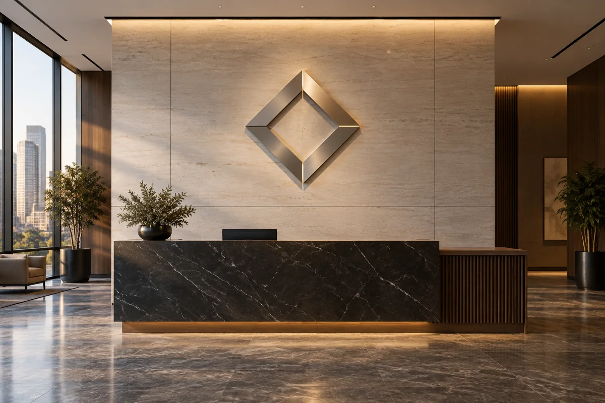
Your reception looks considered in person, but every team photograph makes the logo appear washed out or strangely dark. The instinct is to replace it with a more expensive material. Before doing that, check whether the problem is the finish, the wall, the lighting or the position from which photographs are usually taken.
A material cannot be judged independently of the room. Brushed metal, painted faces, acrylic and illuminated assemblies can each produce a strong result in an appropriate setting. The buying decision becomes more reliable when the sample is reviewed as part of the actual reception scene.
Describe the photographs you actually need
List the ordinary uses of the reception background. These might include a visitor taking a phone photo, a staff portrait, a video call or a professional shoot. Each use can involve a different camera position, lighting arrangement and amount of the wall in view.
Choose the most frequent uses as the acceptance scenarios. A sign should not be optimised solely for a carefully lit launch photograph if most later images will come from phones under everyday ceiling lights. Equally, a specialist photography requirement should be disclosed before a standard reception feature is quoted.
Take reference photographs of the existing space with the normal lights switched on. Include daylight if it commonly reaches the wall. These images give the designer a starting point and reveal whether the logo area competes with a window, downlight, screen or strongly patterned background.
Diagnose the existing scene before choosing a finish
Look at the photographs alongside the room itself. If the entire wall is overexposed, replacing only the logo may not solve the problem. If the logo is clear from one position but disappears from another, the relationship between the finish and surroundings needs closer examination.
Mark the expected camera positions on a simple room sketch. Keep reception circulation and accessibility in mind; do not assume people can always stand at the one angle that flatters the sign. The useful test reflects where visitors and staff can naturally position themselves.
Ask whether the wall colour will remain unchanged. A finish selected against a temporary paint sample can behave differently after the final surface is installed. Record the actual wall specification and any planned lighting changes so the sign decision is not based on a room that will soon disappear.
Compare physical samples under ordinary lighting
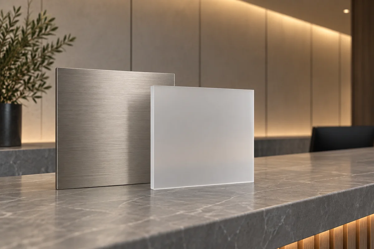
Request samples large enough to show the relevant surface qualities. A tiny swatch can identify a colour but may not reveal how a broader face reflects the room or how an edge appears. Where practical, include a representative character or logo detail at a realistic scale.
Place the alternatives against the intended background in a safe, temporary arrangement managed by the supplier. Review them at the common viewing positions. A sample should not be attached in a way that damages the wall or creates a falling-object risk simply to obtain a photograph.
Keep the lighting consistent between samples. If one is photographed beneath a bright task light and another under the normal reception lighting, the comparison is misleading. Record which lights were on and whether daylight was present so the preferred effect can be understood later.
Do not assume brushed metal always photographs better than polished metal, or that matte acrylic always avoids glare. Finish texture is one variable within the whole scene. The sample test should answer the project-specific question without turning one result into a universal material ranking.
Review phone photographs without special rescue work
Take a normal photograph from each chosen position using the settings staff are likely to use. You can also keep a controlled comparison set, but avoid relying on elaborate editing to make a poor everyday result look acceptable. The sign will appear in images that the business cannot retouch.
Check whether the business name remains readable at the size the photograph will actually be shared. A close crop can conceal a problem that returns when the entire reception area is visible. Review an ordinary phone screen as well as a large monitor.
If video matters, record a short clip with the planned lighting. Review it for distracting changes or artefacts and ask the lighting supplier to investigate any issue. Do not diagnose a technical cause from a single phone recording or assume that a different sign face alone will resolve it.
Include the mounting and edge appearance
The face material is only part of a dimensional logo. Ask how the edges, returns and mounting arrangement will look from the reception entrance and from seated positions. A beautiful face can be undermined by an unexpected side colour or a visible support that was absent from the rendering.
Have the supplier show the proposed depth and spacing from the wall. Those choices affect the visual relationship between the logo and its background. If illumination is proposed, review the actual assembly concept rather than accepting a soft glow added to a digital image.
Keep fixing and electrical design with the responsible professionals. The buyer can ask for concealed or visually restrained details, but the solution must be appropriate to the wall and installation. A preference for an invisible fixing should not become an instruction to use an unsuitable mounting method.
Think about fingerprints and cleaning
Reception features sit in working spaces. People may touch reachable surfaces, cleaners may work close to them and furniture may later move. Ask which marks are likely to be visible on the exact finish and how the supplied product should be maintained.
PLEXIGLAS publishes material-specific cleaning guidance. Its existence is a useful reminder to obtain instructions for the actual surface rather than treating every transparent or glossy sign as ordinary window glass. Pass the appropriate supplier guidance to the cleaning team at handover.
Ask what happens if one element becomes damaged. Can that component be replaced while retaining an acceptable visual match, and what records are needed? Keep the approved colour and finish references. A vague invoice saying "metal logo" is not enough to reproduce a particular appearance later.
Agree an acceptance record that can be repeated
Keep the selected sample reference, wall finish, lighting arrangement and chosen photo positions together. The record should describe what the buyer has accepted in practical terms. "Premium look" is subjective; "name remains clear in the ordinary reception photo from this position" can be reviewed again.
At installation, compare the result under those agreed conditions. Record visible differences and discuss them with the supplier before changing camera settings or room lighting to conceal the discrepancy. A variation might be a correctable installation issue, a material mismatch or simply a changed room assumption.
Do not expect identical colour on every device. The objective is a useful and consistent reception feature, not an impossible promise that every phone produces the same image. Agree how visual concerns will be judged so a reasonable review does not become an endless search for one perfect photograph.
Check the background as a working space
Look for everyday objects that may appear in the same frame: brochure stands, visitor notices and a monitor behind the desk. A successful material test can be undermined if the finished room places competing messages directly beneath the logo. Agree which elements normally belong in the photographic background.
Keep this proportionate to reception operations. Staff should not need to dismantle the desk every time a visitor takes a picture. A useful design works with the normal room arrangement and makes any occasional photography setup easy to understand.
Spend on the variable that solves the problem
Imagine a hypothetical consultancy choosing between a brushed metallic logo and a matte painted version. The metallic sample looks attractive close up, but from the normal team-photo position it reflects a bright window. The painted sample gives a clearer identity in that specific scene, despite being the less glamorous material description.
In another room, moving a planned light or simplifying the background may improve the result without replacing the chosen sign material. That is why the reception scene should be reviewed before the purchase becomes a competition between product labels.
For an Auronix reception and lobby signage enquiry, provide room photographs, the intended logo position and the images you need to create. The coordinated brief can then compare finish, mounting and lighting around the daily use of the room, with an acceptance test the buyer understands.
FAQs
Which reception sign material photographs best?
There is no universal winner independent of the room. Compare physical samples against the actual wall under the lighting and camera positions that matter to your business before selecting a finish.
Is polished metal always a poor choice?
No. It may create the intended appearance in a suitable setting. Review what it reflects from normal viewing positions instead of rejecting or approving it solely because of the material label.
Can a rendering replace a physical sample?
A rendering helps establish composition and scale, but it cannot reliably reproduce the interaction between a real finish and the room. Use a relevant physical sample for the final surface decision.
Should phone flash be part of the review?
Include it if it represents an important real use, alongside ordinary photographs without special lighting. One flash image should not become the only acceptance condition for a reception used throughout the day.
Why test the logo at normal sharing size?
A sign that looks clear in a tight, high-resolution crop may disappear in a wider image on a phone. Review the composition as visitors or staff are likely to share it.
Does backlighting guarantee a better photograph?
No. The result depends on the assembly, background and camera conditions. Review a representative illuminated sample and test any important video use before treating lighting as the solution to every visibility problem.
What should the supplier know about the wall?
Provide its final finish, colour and known construction information, plus planned lighting changes. The responsible installer must assess mounting suitability rather than relying only on the appearance of a photograph.
How should cleaning be specified?
Request instructions for the actual supplied material and finish, then pass them to the cleaning team. Avoid assuming that products used on nearby glass or furniture are suitable for the sign.
What helps with a later replacement letter?
Retain the production artwork, material and colour references, finish description and installation record. These give the supplier a defined target instead of asking it to match an unidentified surface from memory.
When should the installed reception sign be accepted?
Review it using the agreed lighting and viewing scenarios after installation. Record any mismatch against the approved sample or specification, and resolve the difference with the supplier before closing the handover.
