Advertising & Branding /
3D Letters or a Lightbox: Which Facade Sign Reads Better From the Road
Choose between raised letters and a lightbox using a practical day-and-night viewing test, with maintenance included in the decision.
By Auronix Advertising
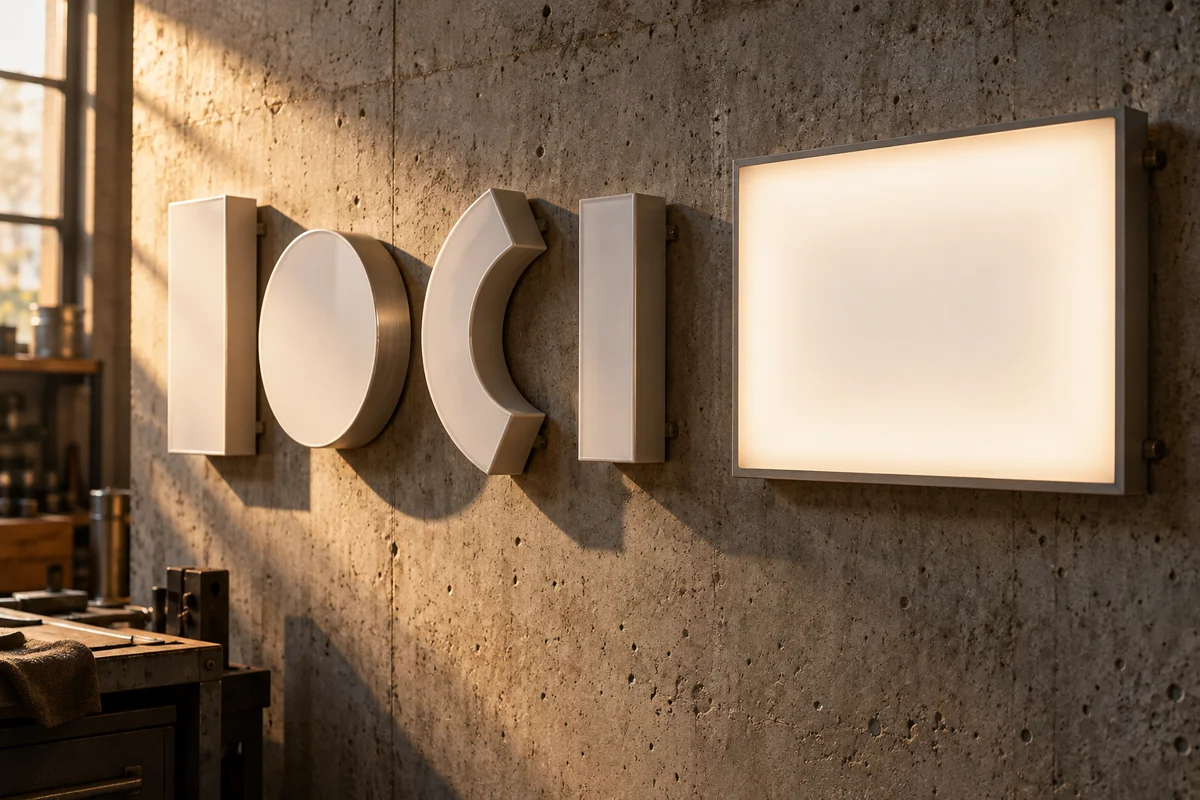
A rendering can make almost any shop sign look convincing. It shows the frontage straight on, removes parked vehicles and usually chooses flattering light. Your customers may first see that same sign at an angle, above an awning, with several brighter neighbours competing for attention.
Choosing between 3D letters and a lightbox starts with that real view. Neither format automatically wins by day or after dark. The useful comparison holds the location, message and viewing conditions steady, then tests what each construction makes easier or harder to read.
Define the two proposals properly
"3D letters" covers several constructions. Flat-cut characters, built-up letters with illuminated faces and halo-lit letters do not create the same appearance. Ask the supplier to identify the proposed face, returns, mounting arrangement and illumination, rather than comparing a broad label with a detailed lightbox specification.
A lightbox also needs a description. Its face material, graphics, depth, lighting layout and frame affect the finished result. A box shown as an evenly glowing rectangle in a visual is not proof that the actual assembly will produce that effect.
Put both descriptions beside the same approved wording. If one quotation quietly shortens the name or removes a secondary line, you are comparing two design briefs as well as two physical formats. Decide whether those changes are acceptable before comparing the totals.
Map where recognition has to happen
List the safe, lawful observation points from which customers approach the business. Include pedestrians arriving along the pavement and passengers approaching from the relevant direction. Photograph from accessible public locations without stepping into traffic or stopping where parking is prohibited.
Record obstacles that are present on an ordinary day: trees, parked delivery vehicles, awnings and neighbouring signs. A sign that reads beautifully from directly opposite may still be hidden on the approach that matters most. Enlarging its letters will not fix an obstruction that covers the whole fascia.
Give the designer these photographs with the intended sign area marked. Ask for both concepts superimposed at the same realistic scale. Keep a separate close-up for reviewing finishes; do not let that detail view replace the wider view used to judge recognition.
Test the message before adding brightness
Ask someone unfamiliar with the business to look at each concept briefly, then say what they understood. Could they identify the name? Could they tell where the entrance was? Record the answers rather than asking only which version looks more expensive.
If the business name is long, a crowded secondary slogan may be the first thing to remove. Try a clearer hierarchy before increasing the overall sign area. The purpose of the road-facing sign may simply be identification, with opening hours and detailed services handled nearer the entrance.
Compare light and dark backgrounds using the actual brand colours. Raised characters can separate well from a plain backing, but a textured or reflective wall may complicate their edges. A lightbox can provide a controlled background, although poor artwork can still make that background difficult to read.
Do not treat a dark wall as automatically suitable for every metallic finish. A reflective face changes with its surroundings. Request a material sample in the intended position, or the closest safe equivalent, before assuming the polished sample on the supplier's desk predicts the facade result.
Review daylight and evening separately
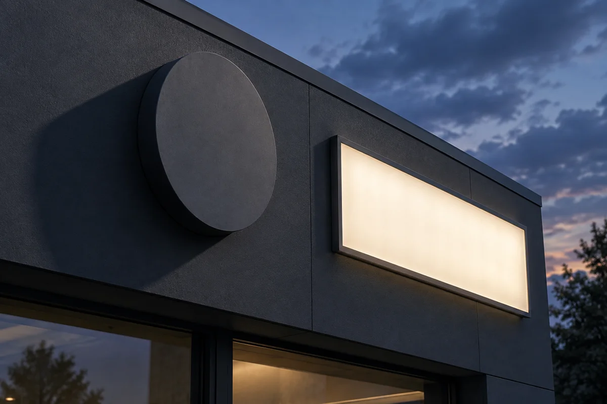
Use one review session for the unlit daytime appearance and another for the proposed evening appearance. The first checks face colour, contrast and shadows. The second checks whether the name remains distinct and whether the illumination produces distracting bright patches or loses fine details.
For illuminated samples, ask for the intended combination of face material and lighting components. PLEXIGLAS describes dedicated acrylic products for backlighting and edge lighting, illustrating why "acrylic face" alone is an incomplete specification. The relevant question is which product and assembly the supplier proposes for this sign.
Do not infer a brightness ranking from the words lightbox, face-lit or halo-lit. Ask to see the actual effect. Halo lighting depends on the surface behind the characters; a face-lit design depends on its face and internal arrangement. A photograph with automatic exposure can hide differences that are obvious in person.
If the building controls lighting hours or output, give that information to both bidders. A design that depends on operating brighter or longer than the site allows has not met the brief, however attractive the demonstration looks.
Ask what maintenance would involve
Request a plain explanation of how each proposal would be inspected and serviced. Which parts can be accessed, and from where? Does a visit require building coordination, specialist access equipment or removal of a large face? Those questions can affect lifetime cost more than a minor difference in the initial quote.
Avoid assuming that a failed light always affects one letter or an entire box. The outcome depends on the wiring and component arrangement. Ask the supplier to explain likely serviceable parts and how the proposed design limits disruption when one component needs attention.
Have the responsible contractor assess access and electrical arrangements. Do not prescribe a ladder or a fixing method from a photograph. The buyer needs an allocated responsibility and a priced access assumption, not instructions for personally reaching an elevated sign.
Also request care instructions for the exact finish. A painted metal face, printed graphic and acrylic sheet may require different treatment. Keep those instructions with the handover record so routine building cleaning does not rely on whatever chemical happens to be available.
Compare quotations with the same boundaries
Ask each bidder to show the included artwork preparation, fabrication, illumination, installation and removal of any existing sign. Identify access, power provision, permit coordination and making good separately where relevant. An apparently cheaper proposal may simply omit a task included by the other supplier.
Do not rely on a universal per-letter or per-square-metre rule. Letter count is one input, but size, detail, construction and installation conditions also matter. For a lightbox, face construction and servicing arrangements can change the scope even when the visible dimensions stay the same.
Record proposed substitutions. If an alternative face material is suggested to meet the budget, ask whether the sample and lighting review must be repeated. A material name changed in the quotation should not silently invalidate the visual result the buyer previously accepted.
Check the sign with the business closed
Include the closed-shop appearance in the review. Roller shutters, security grilles or a dark interior can change the backdrop after trading finishes. If the sign is intended to identify the premises outside opening hours, test that situation explicitly instead of assuming the open-shop rendering represents it.
Also consider how customers find the entrance once they recognise the name. A first-floor identity feature may need a separate, appropriately reviewed directional cue nearer the access point. Increasing the brightness of the main sign will not necessarily explain which door leads upstairs.
Use a simple decision record
Give each option a short written assessment for daytime recognition, evening recognition, property fit and service access. Attach the observation photographs and sample references. The record does not need a complicated score; it needs enough evidence to explain why one proposal meets the business's priorities better.
Consider a hypothetical first-floor clinic with a long name and an entrance beneath an awning. The first concept fills the fascia with thin characters. The second uses a contrasting panel and a clearer name hierarchy. The panel may be the better answer because of that layout, not because lightboxes are inherently superior.
Now imagine the same frontage with a short name and a visually busy rectangular panel competing with adjacent shops. A restrained set of suitably specified letters could make identification clearer. Testing the actual alternatives prevents a format preference from becoming an unsupported rule.
Before release, confirm that the accepted sample, drawing and quotation describe the same object. Keep any property and authority decisions separate from the design review. For an Auronix 3D letter and logo sign brief, bring the approach photographs and operating hours so coordinated fulfilment can be discussed around evidence from your frontage.
FAQs
Are 3D letters always more readable during the day?
No. Their result depends on the face colour, backing surface, shadows and wordmark. Compare the proposed letters against the actual facade instead of assuming that physical depth guarantees stronger contrast.
Does a lightbox always win after dark?
No. A poorly specified or crowded lightbox can read worse than a well-designed illuminated letter sign. Review the actual lighting and artwork together from the important viewing positions.
What should I photograph before requesting quotes?
Capture the entire frontage and safe approach views in daylight and after dark. Include normal obstructions and neighbouring signs, then identify the intended sign area without changing its apparent scale.
Can a screen mock-up prove the final lighting quality?
A mock-up is useful for composition, but it cannot establish the real output or uniformity of a physical assembly. Request a relevant sample and a written construction specification before accepting the effect.
How do I compare halo lighting with face lighting?
Use the actual proposed background and sample construction where possible. Check whether the business name remains clear at the relevant distance, and avoid relying on photographs taken with different exposure settings.
Should a long name be made smaller to fit?
First review the message hierarchy and remove unnecessary competing information. If the essential name still becomes difficult to recognise, ask for alternative layouts within the site's permitted sign area.
Which option costs less to maintain?
That depends on the component arrangement and access conditions. Ask both bidders how servicing happens, what equipment or building coordination is assumed, and which parts can be replaced individually.
Can existing power be assumed in the quotation?
Only after the relevant professional has checked what is available and suitable. Ask the quote to state its electrical scope and any exclusions clearly, rather than treating a nearby supply as confirmation.
Is the cheapest per-letter rate a useful comparison?
It is incomplete without letter dimensions, construction, finish and installation scope. Compare complete proposals for the same drawing so omissions or different materials do not distort the apparent saving.
What should be signed off before fabrication?
Identify the final drawing, accepted material or lighting sample and matching commercial scope. Confirm the required property, technical and authority decisions separately, then issue an explicit release for the correct revision.
