Advertising & Branding /
Matching Pantone Brand Colours in Digital Print: What CMYK Can and Cannot Do
Many Pantone spot colours fall outside the CMYK gamut, and metallics cannot be simulated at all. Use Color Bridge values, agree the print standard and approve a physical proof before any full run.
By Ashker
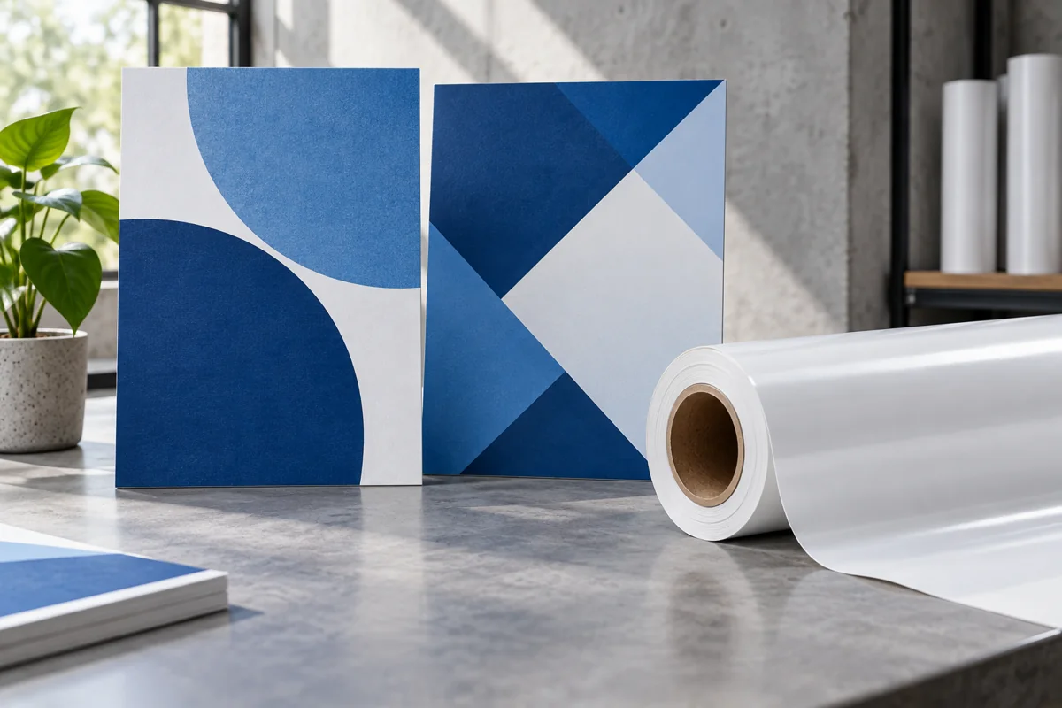
A brand colour that looks perfect on screen can arrive from the printer slightly dull, darker or simply wrong. The problem usually is not careless printing. It comes from the difference between Pantone spot colours and the CMYK inks most digital presses actually use. Understanding that difference helps you set realistic expectations and protect your brand on every print run.
This guide explains why some Pantone colours cannot be matched exactly in CMYK digital print. It draws on Pantone's own published guidance about its Color Bridge system and CMYK limits. It also covers metallic and fluorescent colours, print standards and the proof step that prevents an expensive off-brand run. The advice applies equally to brochures, banners, signs and packaging alike.
Why can't digital print always match a Pantone colour?
Pantone spot colours are mixed inks designed to produce one exact, consistent colour on press. Most digital presses build colours from cyan, magenta, yellow and black dots instead. That CMYK range, called a gamut, cannot reach every colour a mixed spot ink can produce.
Pantone states in its graphics webinar FAQ that many Pantone spot colours are outside the commercial CMYK gamut. It gives PANTONE 265 C as one example from its session. Bright oranges, vivid blues and strong greens are often the hardest brand colours to reproduce in CMYK.
Quick Answer
Pantone spot colours are mixed inks, while digital presses use CMYK dots with a smaller gamut. Pantone confirms many fall outside commercial CMYK, so exact matches are not always possible.
What is the Pantone Color Bridge?
The Pantone Color Bridge guide shows spot colours beside their nearest industry-standard CMYK matches. Designers use it to see how a spot colour will look when printed in CMYK. It helps everyone set expectations before artwork reaches the printer.
Pantone advises selecting colours from the Color Bridge libraries when CMYK output must match its guides. Converting spot colours automatically in design software such as Adobe tools can produce different CMYK values. Pantone's FAQ notes that CMYK versions can look dull beside the original spot colour because of CMYK's limited gamut.
Quick Answer
The Pantone Color Bridge shows each spot colour next to its nearest industry-standard CMYK match. Pantone recommends using the Color Bridge libraries for CMYK output instead of automatic software conversions.
Can metallic and fluorescent brand colours be printed digitally?
Metallic Pantone colours cannot be reproduced with standard four-colour CMYK inks. Pantone's FAQ states plainly that there is no way to simulate metallic with CMYK. Gold, silver and copper brand colours therefore need special metallic inks, foils or other finishing methods.
Fluorescent and very pale colours are also difficult in standard CMYK printing. If your brand guidelines rely on these colours, discuss alternative inks or finishes with your printer early in the project. Some jobs may need a different printing method, as explained in our offset versus digital printing guide.
Quick Answer
Pantone states there is no way to simulate metallic colours with CMYK, so gold or silver needs special inks or foils. Discuss metallic and fluorescent colours with your printer early.
Which print standard should you ask for?
Colour accuracy also depends on how the printer calibrates and controls its press. Pantone's FAQ advises asking printers to work to a recognised reference, such as GRACoL, with G7 Colorspace matching. Simply hearing that a printer is calibrated is not enough to guarantee consistent colour results.
Ask your printer which standard and colour profile they use, and keep that information with your artwork. Consistent standards matter most when one campaign is printed by several suppliers. Different substrates, from coated paper to vinyl banners, will still show slight variations between them.
Quick Answer
Ask printers which colour standard they print to, such as GRACoL with G7 Colorspace matching, as Pantone suggests. Record the profile used so repeat orders and other suppliers stay consistent.
How does a proof prevent an off-brand print run?
A physical proof on the actual material is the most reliable way to approve colour before a full run. Screens vary widely, so approving colour from a PDF on a laptop is risky. Compare the proof with a printed Pantone guide under consistent, neutral lighting.
Mark any colour corrections clearly on the proof and request a second proof if changes are significant. Approve the final proof in writing and keep it as the reference for future reprints. For large banners, our guide to large format resolution covers other proof checks.
Quick Answer
Approve colour from a physical proof on the real material, compared with a printed Pantone guide under neutral light. Keep the signed proof as the reference for every future reprint.
Main Takeaways
Many Pantone spot colours fall outside the CMYK gamut, so exact digital matches are not always possible. Use Pantone Color Bridge values for CMYK artwork rather than automatic conversions. Metallic colours cannot be simulated with CMYK and need special inks or foils. Agree the print standard, approve a physical proof on the real material and keep it for every reprint.
Protect your brand colour before the first print run
Share your brand guidelines with the printer before artwork is finalised, including every Pantone reference used. Ask which colours may fall outside CMYK and how close the printer realistically expects to get on your material. Plan metallic or fluorescent colours separately with suitable special inks or finishes from the start. Approve a physical proof before any full production run begins.
Auronix Advertising provides digital printing in the UAE with physical proofing for brand-critical colours on every material. Send your artwork, brand guidelines, Pantone references, materials and quantities for a quote. We will flag colours that need special inks, finishes or extra proofing before any printing begins. For outdoor signs and banners, read our guide to UV versus eco-solvent outdoor printing.
Sources & References
FAQs
Why does my brand colour look different in print?
Screens show colour with light, while print uses inks on a surface with a smaller gamut. Many Pantone spot colours also fall outside what CMYK digital presses can accurately reproduce.
Can any Pantone colour be matched exactly in digital print?
Not always, because Pantone itself confirms many spot colours sit outside the commercial CMYK gamut. Some colours match closely, while others need special inks or a different printing method entirely.
What is the difference between Pantone C and CP colours?
C colours are Pantone spot colours on coated paper, while CP values show their CMYK process versions. Pantone notes CP colours can look noticeably duller because of CMYK's limited gamut.
Can digital printers reproduce gold or silver?
Not with standard CMYK inks alone, because Pantone states metallic colours cannot be simulated with CMYK. Use special metallic inks, foils or other finishing methods instead for those brand colours.
Should I approve colours on screen?
No, screens vary far too much for reliable colour approval. Request a physical proof on the real material and compare it with a printed Pantone guide under neutral lighting conditions.
Which colour values should my designer use?
Use Pantone's Color Bridge values for any CMYK output rather than relying on automatic software conversions. Pantone recommends the Color Bridge libraries when CMYK results must match its printed guides.
Will the same colour look identical on paper and vinyl?
Not exactly, because paper, vinyl and fabric absorb and reflect printed ink differently. Approve proofs on each material and accept small, controlled variations between substrates within one campaign or launch.
What print standard should I ask my printer about?
Ask which reference and profile they print to, such as GRACoL with G7 Colorspace matching. Pantone suggests requesting that matching rather than accepting a general verbal claim of press calibration.
How do I keep colours consistent across reprints?
Keep the signed approved proof, colour values and printer profile together as your reference. Share them with every new supplier so future runs can be compared against the same standard.
Can Auronix match my brand colours in print?
Yes, Auronix Advertising produces proofs on your chosen material and adjusts colours before any full run. We explain where CMYK limits apply and suggest special inks or finishes where needed.
