Advertising & Branding /
3D Sign Letters That Read Well in Daylight: Depth, Contrast and Halo Lighting
Daytime readability depends on letter height, colour contrast with the wall and font, not lighting. Use the USSC legibility index to size letters, then add depth and halo lighting for night.
By Ashker
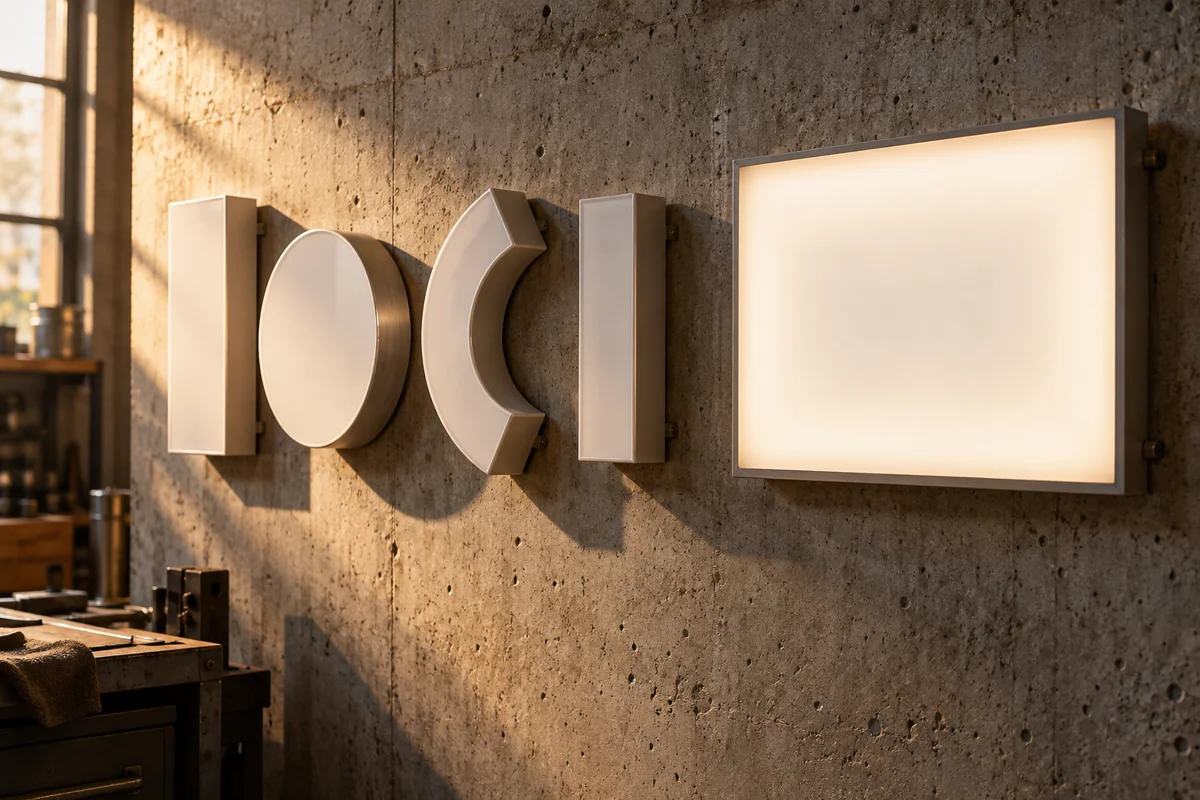
A 3D sign is often designed while looking at a glowing night render. In the UAE, though, most customers see the sign in bright daylight, when the lights are off or barely visible. A sign that looks dramatic at night can disappear against a pale wall at midday. Planning for daylight first keeps the brand readable for most of the hours people actually pass.
This guide explains what makes dimensional letters readable during the day. It uses research-based guidance published by the United States Sign Council Foundation on letter height, colour and contrast. It also covers letter depth, finishes and how halo lighting adds night-time impact without hurting daytime clarity. The same principles apply to shopfronts, offices and building facades.
What makes a 3D sign readable in daylight?
Daytime readability depends mainly on letter size, contrast and font, not on the lighting inside the sign. The USSC Foundation's guideline standards describe legibility as essentially a function of the height, colour and font characteristics of the letters. Lighting matters after dark, but daylight exposes weak contrast.
The same guidelines link a sign's conspicuity to the contrast between the sign and its surroundings. White letters on a cream wall can vanish in strong sun. Dark letters on a light wall, or light letters on a dark panel, usually read better.
Quick Answer
In daylight, readability depends on letter height, colour contrast and font rather than internal lighting. The USSC Foundation links legibility to those letter characteristics and conspicuity to contrast with surroundings.
How tall should the letters be for the viewing distance?
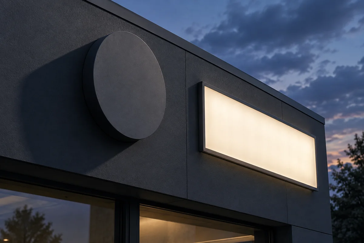
The USSC provides a legibility index, expressed as feet of viewing distance per inch of letter height. They state an average index value of 30 can be used in some situations. In metric terms, that is roughly one centimetre of capital letter height per three metres of viewing distance.
The guidelines also note all-capital text needs about 15 percent more letter height than mixed case. Measure the real viewing distance from the road, car park or mall corridor. Then size letters from that distance, not from a close-up design render.
Quick Answer
The USSC suggests a legibility index of 30 feet per inch of letter height, roughly one centimetre per three metres. All-capital text needs 15 percent taller letters than mixed case.
How does letter depth help during the day?
Letter depth creates shadows that separate the letters from the wall when sunlight strikes the facade at an angle. Deeper letters cast stronger shadows, which can add definition even where colour contrast is modest. Very shallow letters can look like flat stickers from a distance.
Depth must also suit the letter size and the building's overall proportions. Ask your fabricator for a sample letter or a scaled mock-up photographed in real daylight on site. Our guide to 3D letters versus lightbox facades compares the two main approaches in more detail.
Quick Answer
Deeper letters cast shadows that help separate them from the wall in angled sunlight. Match depth to letter size and building proportions, and review a daylight mock-up before fabrication starts.
What does halo lighting add at night?
Halo lighting places LEDs behind solid letters mounted slightly away from the wall. At night, light washes onto the wall and outlines each letter with a soft, even glow. During the day, the same letters still read as solid shapes with their own face colour.
Halo lighting works best on walls that reflect light, so dark or textured backgrounds may weaken the effect. Discuss the wall finish with your fabricator before choosing the lighting style. For energy use and permits, see our guide to illuminated sign power draw and DEWA.
Quick Answer
Halo lighting places LEDs behind letters set off the wall, creating a glowing outline at night. Letters stay solid by day, and wall finish affects how strong the glow appears.
Which colours and finishes work best in strong sun?
Choose letter colours that contrast clearly with the wall in both bright sun and shade. Strong UAE sunlight can wash out pale colours and make gloss finishes reflect glare. Matte or satin finishes usually stay more readable at different viewing angles throughout the day.
Test physical colour samples against the actual wall rather than a printed colour chart or screen. Check them in the morning, at midday and in late afternoon if possible. For reception signs viewed up close, our guide to reception sign materials covers finishes that photograph well.
Quick Answer
Pick letter colours with strong contrast against the wall and prefer matte or satin finishes to reduce glare. Test real samples against the actual wall at different times of day.
Main Takeaways
Daytime readability depends on letter height, contrast and font, not internal lighting. The USSC's average legibility index of 30 suggests roughly one centimetre of letter height per three metres. Use letter depth and matte or satin finishes to add daytime definition against the wall. Add halo lighting for night impact, and always approve the final sign from a daylight mock-up.
Design the sign for the hours people actually see it
Measure the real viewing distance from the road or entrance, and photograph the facade wall at different times of day. Choose letter colours that contrast strongly with that wall in bright midday sun. Size letters using a recognised legibility guide, allowing extra height for any all-capital text. Then review a daylight mock-up before approving any lighting, finish or fabrication details.
Auronix Advertising produces 3D signage in the UAE designed for clear daytime readability and strong night-time impact. Send us photos of the facade at different times, the main viewing distance and your logo files. We will recommend letter sizes, depth, colours, finishes and lighting suited to your building. Request a quote that includes a daylight mock-up before any fabrication begins.
Sources & References
FAQs
Why can't I read my 3D sign during the day?
Usually the letters lack contrast with the wall or are too small for the viewing distance. Lighting cannot fix weak daytime contrast, so review colours, letter size and depth first.
How big should 3D sign letters be?
Size letters from the real viewing distance using a recognised legibility guide. The USSC's average legibility index of 30 suggests roughly one centimetre of letter height per three metres away.
Do capital letters need to be bigger?
Yes, the USSC guidelines note all-capital text needs about 15 percent more letter height than mixed case. Mixed upper and lower case is often easier to read quickly from afar.
What is a halo-lit sign?
It is a sign with solid letters lit from behind, so light washes onto the wall around them. The letters then appear outlined by a soft, even glow at night.
Does halo lighting work on any wall?
It works best on light, smooth, reflective walls, because the glow relies on light bouncing back towards viewers. Dark or heavily textured walls may weaken the halo effect quite noticeably.
How deep should 3D letters be?
Depth should suit the letter size, viewing distance and building proportions. Deeper letters cast stronger daytime shadows, so review a scaled mock-up or sample letter on site before fabrication begins.
Are gloss finishes good for outdoor 3D letters?
Gloss finishes can reflect strong sunlight and create distracting glare at some viewing angles. Matte or satin finishes often stay much more readable throughout the day in bright UAE conditions.
Should I approve a 3D sign from a night render?
No, review daylight views as well, because most people see the sign during the day. Ask your fabricator for a daytime mock-up or a photographed sample against the real wall.
Do illuminated 3D signs need permits?
Signs generally need approval before installation, and illuminated signs also need suitable, safe electrical arrangements. Check permit requirements with the relevant licensing authority and building management well before fabrication begins.
Can Auronix design readable 3D signage?
Yes, Auronix Advertising designs and fabricates 3D signage sized for real viewing distances and strong daylight contrast. We also provide daytime mock-ups, colour samples and lighting options before production starts.
